
파이썬과는 관련없음
https://100.datavizproject.com/
1 dataset. 100 visualizations.
Can we come up with 100 visualizations from one simple dataset? As an information design agency working with data visualization every day, we challenged ourselves to accomplish this using insightful and visually appealing visualizations. We wanted to show
100.datavizproject.com
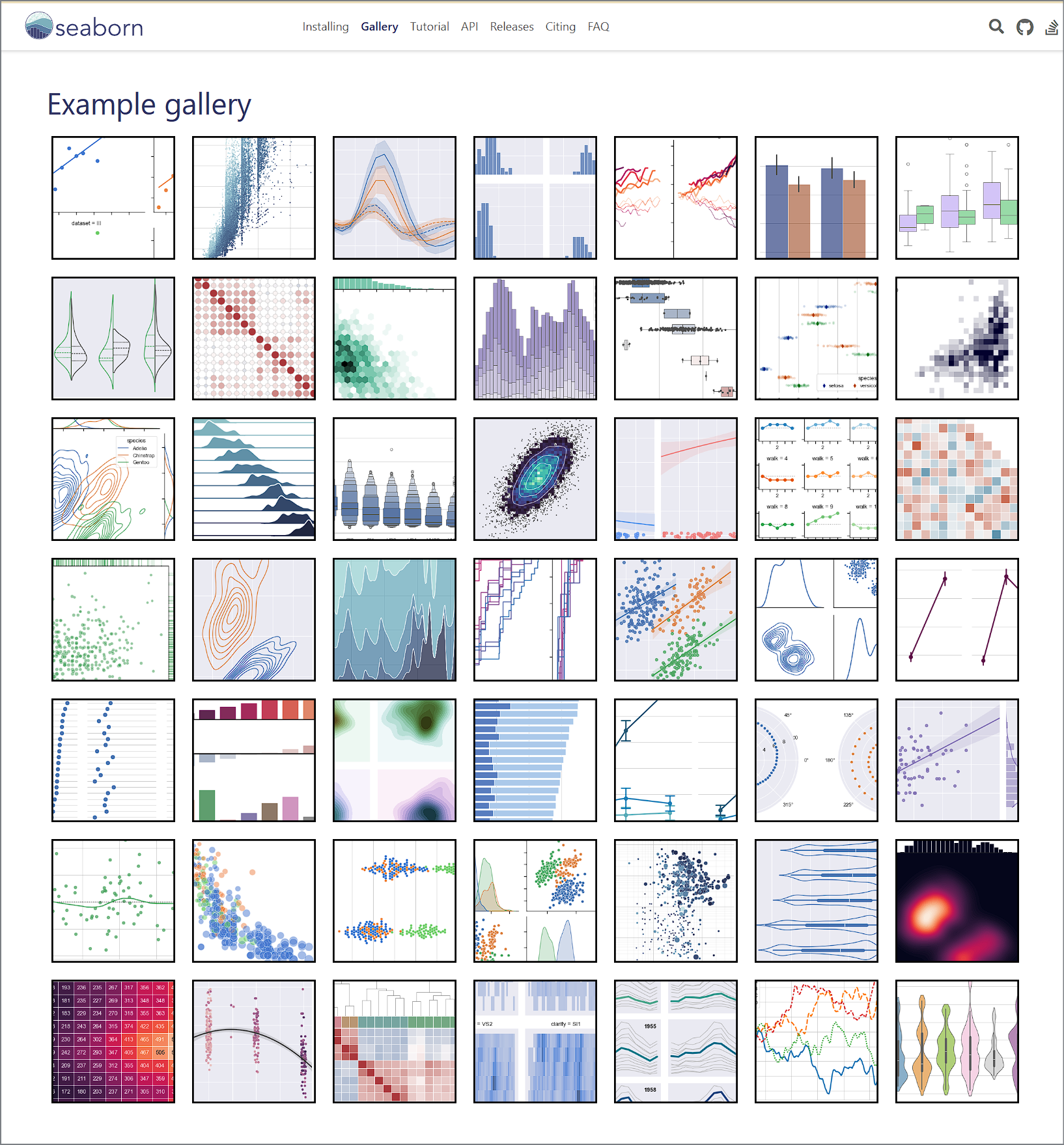
Seaborn Library
https://seaborn.pydata.org/examples/index.html
Example gallery — seaborn 0.13.2 documentation
seaborn.pydata.org
https://seaborn.pydata.org/examples/hexbin_marginals.html

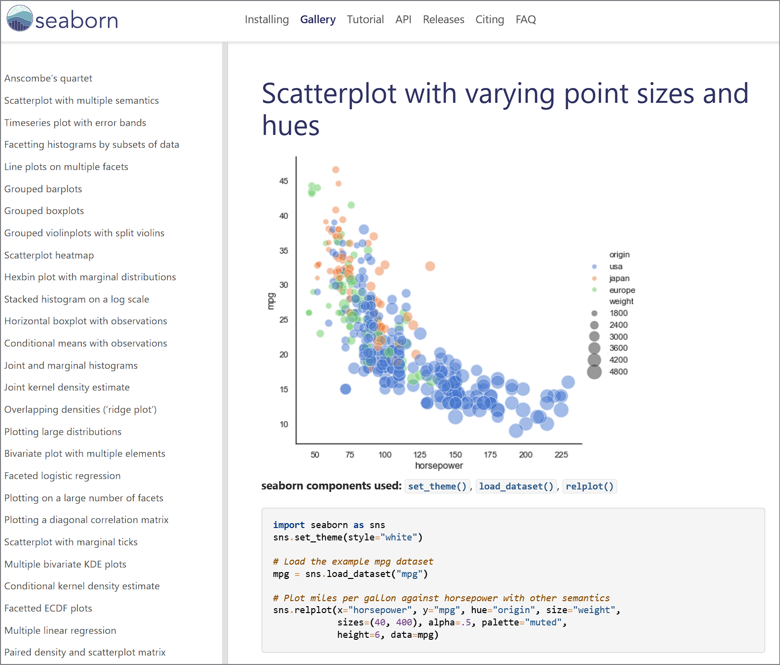
https://seaborn.pydata.org/examples/scatter_bubbles.html
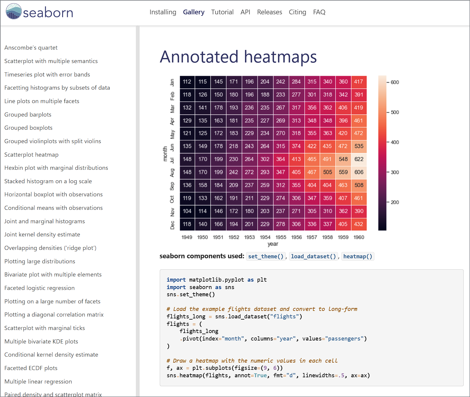
https://seaborn.pydata.org/examples/spreadsheet_heatmap.html
Matplotlib cheatsheets and handouts
https://matplotlib.org/cheatsheets/
Matplotlib cheatsheets — Visualization with Python
matplotlib.org


https://matplotlib.org/stable/plot_types/index
Plot types — Matplotlib 3.10.8 documentation
Plot types Overview of many common plotting commands provided by Matplotlib. See the gallery for more examples and the tutorials page for longer examples. Pairwise data Plots of pairwise \((x, y)\), tabular \((var\_0, \cdots, var\_n)\), and functional \(f(
matplotlib.org

example :: pie(x) chart
import matplotlib.pyplot as plt
import numpy as np

plt.style.use('_mpl-gallery-nogrid')


# make data
x = [1, 2, 3, 4]
colors = plt.get_cmap('Blues')(np.linspace(0.2, 0.7, len(x)))

# plot
fig, ax = plt.subplots()
ax.pie(x, colors=colors, radius=3, center=(4, 4),
       wedgeprops={"linewidth": 1, "edgecolor": "white"}, frame=True)

ax.set(xlim=(0, 8), xticks=np.arange(1, 8),
       ylim=(0, 8), yticks=np.arange(1, 8))

plt.show()
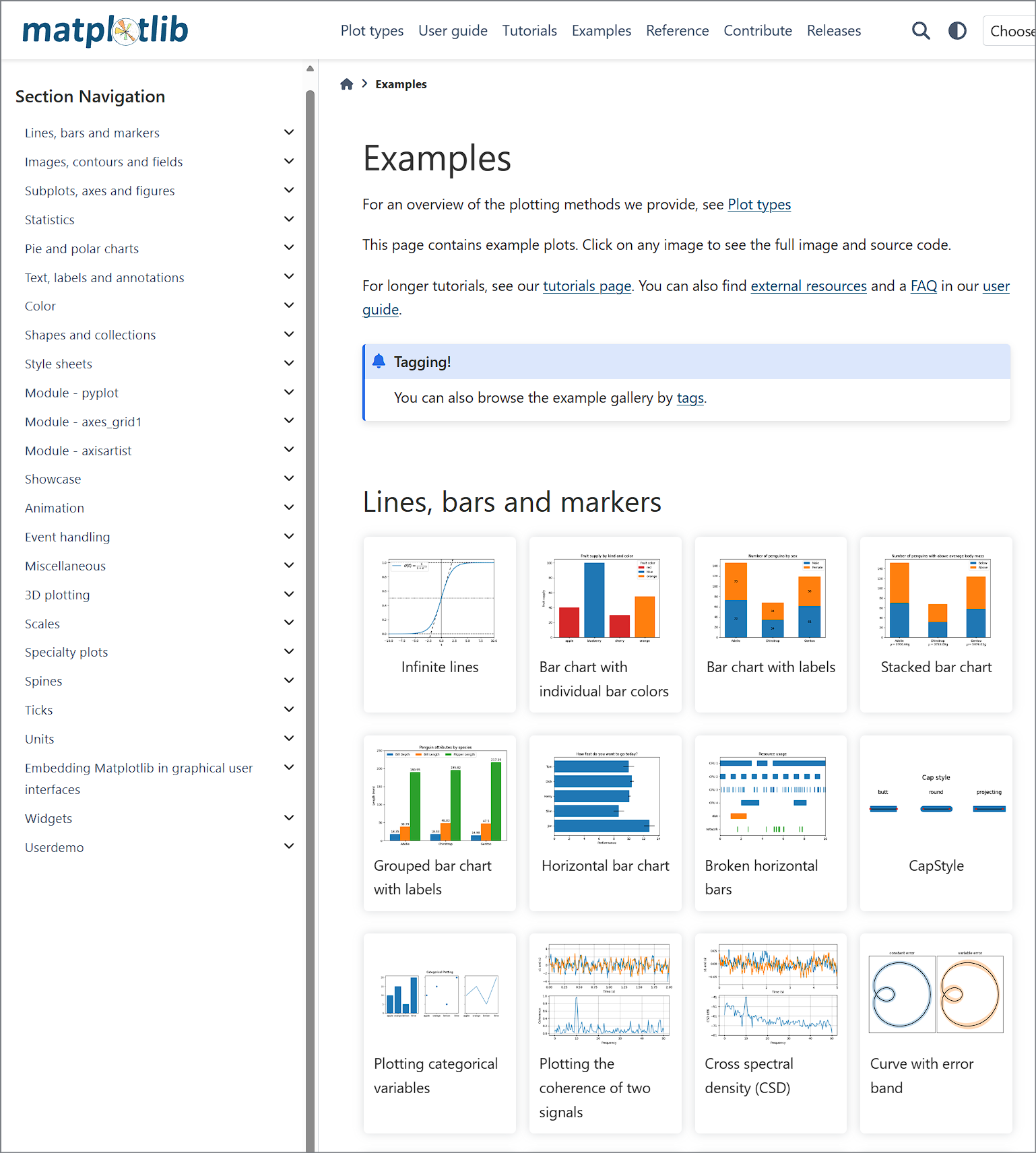
https://matplotlib.org/stable/gallery/index.html
Examples — Matplotlib 3.10.8 documentation
Examples For an overview of the plotting methods we provide, see Plot types This page contains example plots. Click on any image to see the full image and source code. For longer tutorials, see our tutorials page. You can also find external resources and a
matplotlib.org
https://matplotlib.org/stable/gallery/pie_and_polar_charts/index.html

https://matplotlib.org/stable/gallery/lines_bars_and_markers/horizontal_barchart_distribution.html

import matplotlib.pyplot as plt
import numpy as np

category_names = ['Strongly disagree', 'Disagree',
                  'Neither agree nor disagree', 'Agree', 'Strongly agree']
results = {
    'Question 1': [10, 15, 17, 32, 26],
    'Question 2': [26, 22, 29, 10, 13],
    'Question 3': [35, 37, 7, 2, 19],
    'Question 4': [32, 11, 9, 15, 33],
    'Question 5': [21, 29, 5, 5, 40],
    'Question 6': [8, 19, 5, 30, 38]
}


def survey(results, category_names):
    """
    Parameters
    ----------
    results : dict
        A mapping from question labels to a list of answers per category.
        It is assumed all lists contain the same number of entries and that
        it matches the length of *category_names*.
    category_names : list of str
        The category labels.
    """
    labels = list(results.keys())
    data = np.array(list(results.values()))
    data_cum = data.cumsum(axis=1)
    category_colors = plt.colormaps['RdYlGn'](
        np.linspace(0.15, 0.85, data.shape[1]))

    fig, ax = plt.subplots(figsize=(9.2, 5))
    ax.invert_yaxis()
    ax.xaxis.set_visible(False)
    ax.set_xlim(0, np.sum(data, axis=1).max())

    for i, (colname, color) in enumerate(zip(category_names, category_colors)):
        widths = data[:, i]
        starts = data_cum[:, i] - widths
        rects = ax.barh(labels, widths, left=starts, height=0.5,
                        label=colname, color=color)

        r, g, b, _ = color
        text_color = 'white' if r * g * b < 0.5 else 'darkgrey'
        ax.bar_label(rects, label_type='center', color=text_color)
    ax.legend(ncols=len(category_names), bbox_to_anchor=(0, 1),
              loc='lower left', fontsize='small')

    return fig, ax


survey(results, category_names)
plt.show()
import matplotlib.pyplot as plt
import numpy as np
from matplotlib.patches import Circle, RegularPolygon
from matplotlib.path import Path
from matplotlib.projections import register_projection
from matplotlib.projections.polar import PolarAxes
from matplotlib.spines import Spine
from matplotlib.transforms import Affine2D
def radar_factory(num_vars, frame='circle'):
"""
Create a radar chart with `num_vars` Axes.
This function creates a RadarAxes projection and registers it.
Parameters
----------
num_vars : int
Number of variables for radar chart.
frame : {'circle', 'polygon'}
Shape of frame surrounding Axes.
"""
# calculate evenly-spaced axis angles
theta = np.linspace(0, 2*np.pi, num_vars, endpoint=False)
class RadarTransform(PolarAxes.PolarTransform):
def transform_path_non_affine(self, path):
# Paths with non-unit interpolation steps correspond to gridlines,
# in which case we force interpolation (to defeat PolarTransform's
# autoconversion to circular arcs).
if path._interpolation_steps > 1:
path = path.interpolated(num_vars)
return Path(self.transform(path.vertices), path.codes)
class RadarAxes(PolarAxes):
name = 'radar'
PolarTransform = RadarTransform
def __init__(self, *args, **kwargs):
super().__init__(*args, **kwargs)
# rotate plot such that the first axis is at the top
self.set_theta_zero_location('N')
def fill(self, *args, closed=True, **kwargs):
"""Override fill so that line is closed by default"""
return super().fill(closed=closed, *args, **kwargs)
def plot(self, *args, **kwargs):
"""Override plot so that line is closed by default"""
lines = super().plot(*args, **kwargs)
for line in lines:
self._close_line(line)
def _close_line(self, line):
x, y = line.get_data()
# FIXME: markers at x[0], y[0] get doubled-up
if x[0] != x[-1]:
x = np.append(x, x[0])
y = np.append(y, y[0])
line.set_data(x, y)
def set_varlabels(self, labels):
self.set_thetagrids(np.degrees(theta), labels)
def _gen_axes_patch(self):
# The Axes patch must be centered at (0.5, 0.5) and of radius 0.5
# in axes coordinates.
if frame == 'circle':
return Circle((0.5, 0.5), 0.5)
elif frame == 'polygon':
return RegularPolygon((0.5, 0.5), num_vars,
radius=.5, edgecolor="k")
else:
raise ValueError("Unknown value for 'frame': %s" % frame)
def _gen_axes_spines(self):
if frame == 'circle':
return super()._gen_axes_spines()
elif frame == 'polygon':
# spine_type must be 'left'/'right'/'top'/'bottom'/'circle'.
spine = Spine(axes=self,
spine_type='circle',
path=Path.unit_regular_polygon(num_vars))
# unit_regular_polygon gives a polygon of radius 1 centered at
# (0, 0) but we want a polygon of radius 0.5 centered at (0.5,
# 0.5) in axes coordinates.
spine.set_transform(Affine2D().scale(.5).translate(.5, .5)
+ self.transAxes)
return {'polar': spine}
else:
raise ValueError("Unknown value for 'frame': %s" % frame)
register_projection(RadarAxes)
return theta
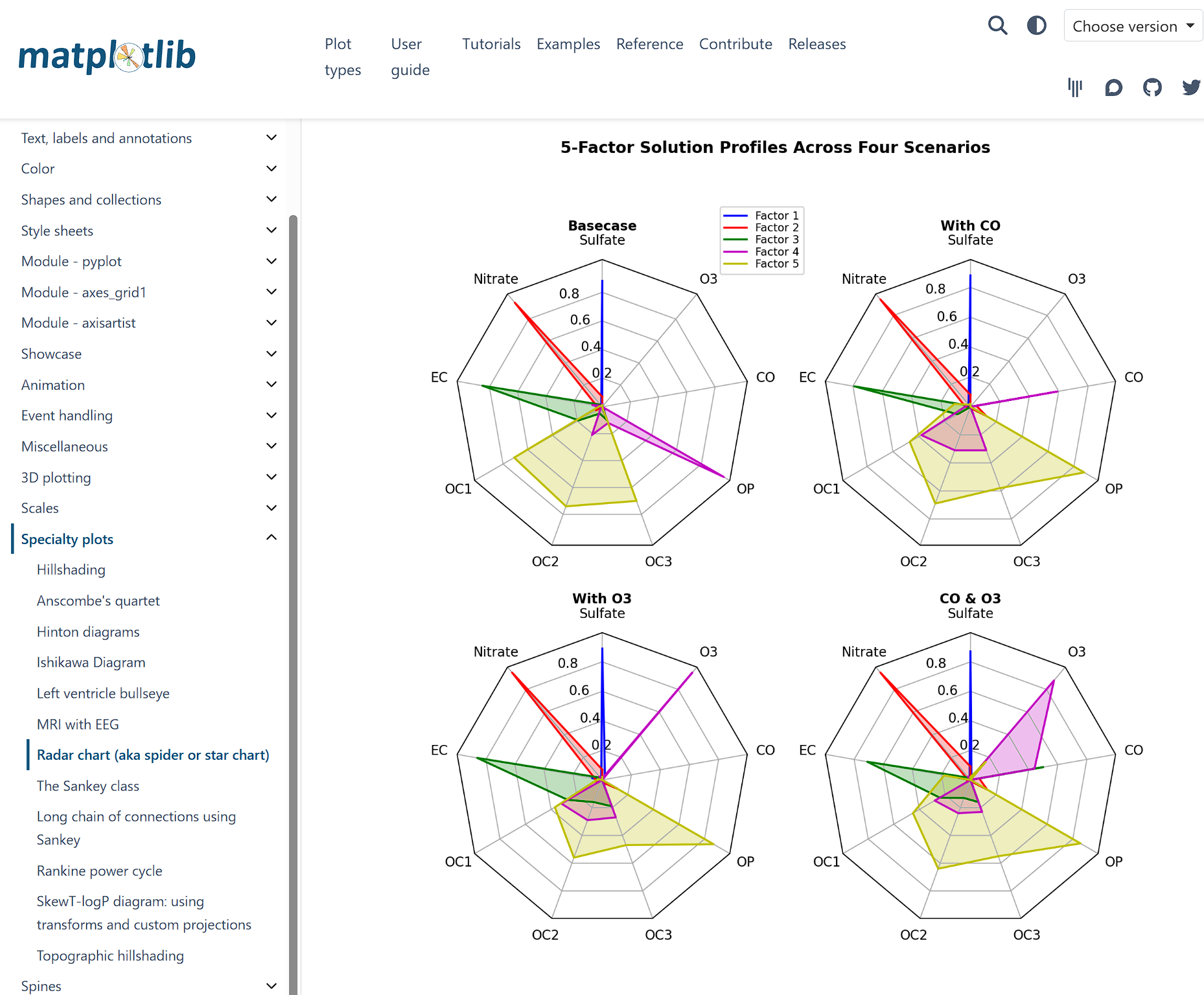
def example_data():
# The following data is from the Denver Aerosol Sources and Health study.
# See doi:10.1016/j.atmosenv.2008.12.017
#
# The data are pollution source profile estimates for five modeled
# pollution sources (e.g., cars, wood-burning, etc) that emit 7-9 chemical
# species. The radar charts are experimented with here to see if we can
# nicely visualize how the modeled source profiles change across four
# scenarios:
# 1) No gas-phase species present, just seven particulate counts on
# Sulfate
# Nitrate
# Elemental Carbon (EC)
# Organic Carbon fraction 1 (OC)
# Organic Carbon fraction 2 (OC2)
# Organic Carbon fraction 3 (OC3)
# Pyrolyzed Organic Carbon (OP)
# 2)Inclusion of gas-phase specie carbon monoxide (CO)
# 3)Inclusion of gas-phase specie ozone (O3).
# 4)Inclusion of both gas-phase species is present...
data = [
['Sulfate', 'Nitrate', 'EC', 'OC1', 'OC2', 'OC3', 'OP', 'CO', 'O3'],
('Basecase', [
[0.88, 0.01, 0.03, 0.03, 0.00, 0.06, 0.01, 0.00, 0.00],
[0.07, 0.95, 0.04, 0.05, 0.00, 0.02, 0.01, 0.00, 0.00],
[0.01, 0.02, 0.85, 0.19, 0.05, 0.10, 0.00, 0.00, 0.00],
[0.02, 0.01, 0.07, 0.01, 0.21, 0.12, 0.98, 0.00, 0.00],
[0.01, 0.01, 0.02, 0.71, 0.74, 0.70, 0.00, 0.00, 0.00]]),
('With CO', [
[0.88, 0.02, 0.02, 0.02, 0.00, 0.05, 0.00, 0.05, 0.00],
[0.08, 0.94, 0.04, 0.02, 0.00, 0.01, 0.12, 0.04, 0.00],
[0.01, 0.01, 0.79, 0.10, 0.00, 0.05, 0.00, 0.31, 0.00],
[0.00, 0.02, 0.03, 0.38, 0.31, 0.31, 0.00, 0.59, 0.00],
[0.02, 0.02, 0.11, 0.47, 0.69, 0.58, 0.88, 0.00, 0.00]]),
('With O3', [
[0.89, 0.01, 0.07, 0.00, 0.00, 0.05, 0.00, 0.00, 0.03],
[0.07, 0.95, 0.05, 0.04, 0.00, 0.02, 0.12, 0.00, 0.00],
[0.01, 0.02, 0.86, 0.27, 0.16, 0.19, 0.00, 0.00, 0.00],
[0.01, 0.03, 0.00, 0.32, 0.29, 0.27, 0.00, 0.00, 0.95],
[0.02, 0.00, 0.03, 0.37, 0.56, 0.47, 0.87, 0.00, 0.00]]),
('CO & O3', [
[0.87, 0.01, 0.08, 0.00, 0.00, 0.04, 0.00, 0.00, 0.01],
[0.09, 0.95, 0.02, 0.03, 0.00, 0.01, 0.13, 0.06, 0.00],
[0.01, 0.02, 0.71, 0.24, 0.13, 0.16, 0.00, 0.50, 0.00],
[0.01, 0.03, 0.00, 0.28, 0.24, 0.23, 0.00, 0.44, 0.88],
[0.02, 0.00, 0.18, 0.45, 0.64, 0.55, 0.86, 0.00, 0.16]])
]
return data
if __name__ == '__main__':
N = 9
theta = radar_factory(N, frame='polygon')
data = example_data()
spoke_labels = data.pop(0)
fig, axs = plt.subplots(figsize=(9, 9), nrows=2, ncols=2,
subplot_kw=dict(projection='radar'))
fig.subplots_adjust(wspace=0.25, hspace=0.20, top=0.85, bottom=0.05)
colors = ['b', 'r', 'g', 'm', 'y']
# Plot the four cases from the example data on separate Axes
for ax, (title, case_data) in zip(axs.flat, data):
ax.set_rgrids([0.2, 0.4, 0.6, 0.8])
ax.set_title(title, weight='bold', size='medium', position=(0.5, 1.1),
horizontalalignment='center', verticalalignment='center')
for d, color in zip(case_data, colors):
ax.plot(theta, d, color=color)
ax.fill(theta, d, facecolor=color, alpha=0.25, label='_nolegend_')
ax.set_varlabels(spoke_labels)
# add legend relative to top-left plot
labels = ('Factor 1', 'Factor 2', 'Factor 3', 'Factor 4', 'Factor 5')
legend = axs[0, 0].legend(labels, loc=(0.9, .95),
labelspacing=0.1, fontsize='small')
fig.text(0.5, 0.965, '5-Factor Solution Profiles Across Four Scenarios',
horizontalalignment='center', color='black', weight='bold',
size='large')
plt.show()
_